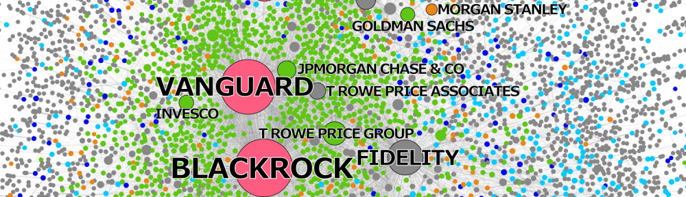
One way to advance the understanding of Global Finance – for academia but also for the wider public – is to visualize global financial structures. Some visualizations that I have created or that I have been involved with are listed below:
Jan Fichtner – The Big Picture of Global Finance
(click to enlarge)
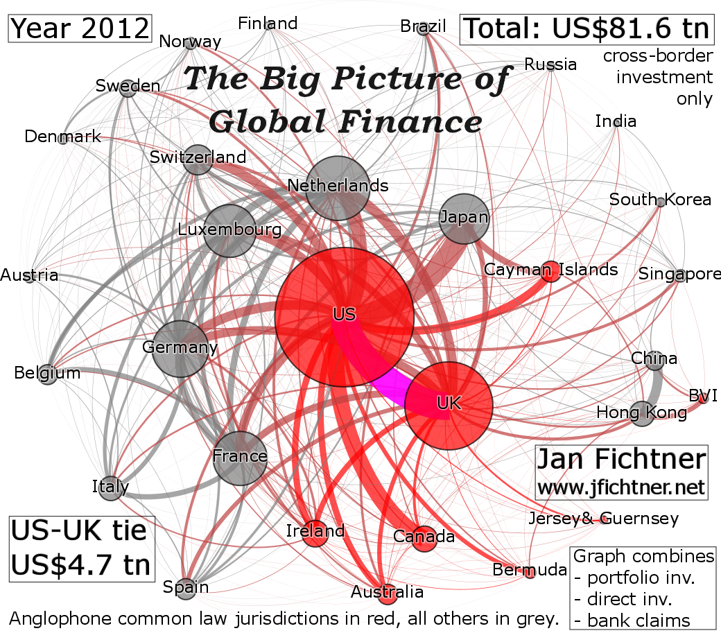
The visualization above is – to the best knowledge of this author – the first one to show the ‘Big Picture of Global Finance’ combining the three major segments of cross-border finance: portfolio investment, direct investment, and banking claims. A version of this graph with less information is part of my article ‘Perpetual decline or persistent dominance? Uncovering Anglo-America’s true strcutural power in global finance‘. The Anglophone countries are shown in red, all others in grey; the bilateral financial relation between the US and the UK is shown in magenta as it is by far the largest one on the planet with US$ 4.7 trillion.
* * *
 (click picture to enlarge)
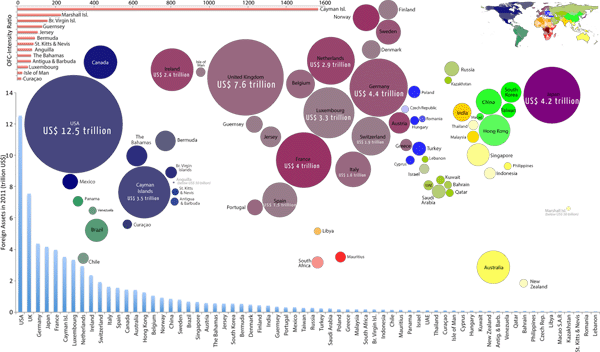
This visualization is taken from “Offshore Financial Centres” (with Benjamin D. Hennig), Political Insight, Vol. 4, No. 3, p. 38 (2013); the larger the circles on the map the more foreign financial assets are booked in the particular jurisdiction. We combined data from the Bank for International Settlements (Locational Banking Statistics) and the International Monetary Fund (Coordinated Portfolio Investment Survey) while avoiding double counting. The map intuitively shows, which jurisdictions have attracted the most foreign assets (US, UK, Germany, Japan, France, Cayman Islands etc.). In the top left corner of the map we plot in red what I have called the ‘Offshore Financial Center-Intensity Ratio’ (foreign assets divided by the GDP of the jurisdiction) in my article “Privateers of the Caribbean: The Hedge Funds-US-UK-Offshore Nexus.” At the bottom we show (in blue) the size of the foreign assets using a bar chart.
* * *
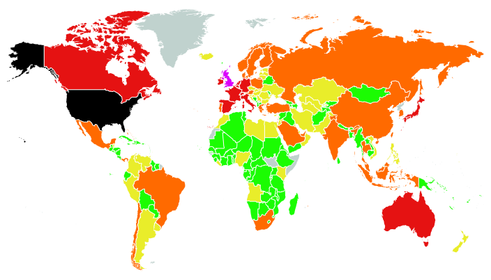 (click picture to enlarge)
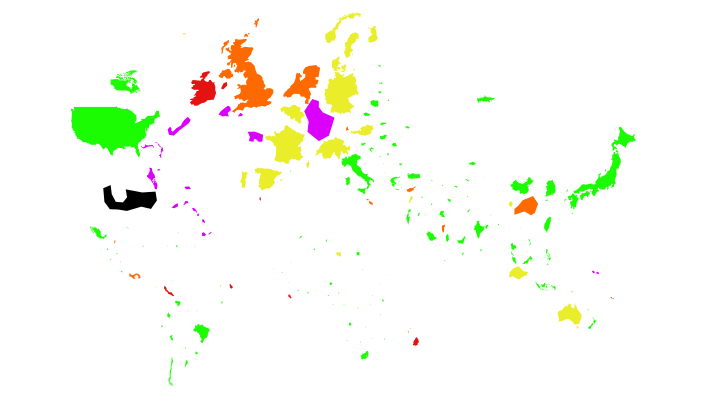
This visualization is taken from my tellmap “The Real Size and Intensity of Offshore Financial Centers.” The different colors show different absolute sizes of external assets booked in the various jurisdictions (similar to the visualization above that uses differently sized circles); the US in black represents the category with the highest foreign assets, the UK in magenta the second highest, then red, orange etc.). However, a tellmap can display both the absolute size, and also the relative size (‘Offshore Financial Center-Intensity Ratio’, see above):
 (click picture to enlarge)
In this tellmap, the size of the jurisdiction directly reflects the size of the foreign assets booked in the jurisdiction; in this way this visualization is similar the the first one that used circles (see above). This visualization, however, is a non-contiguous cartogram, which preserves the geographical shape of the jurisdiction. Colors now show the size of Offshore-Intensity Ratios; the Cayman Islands in black is in the highest category, Bermuda, Jersey, Guernsey, Luxembourg etc. (in magenta) are in the second highest category.
* * *
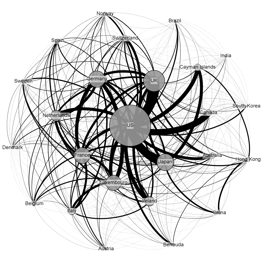
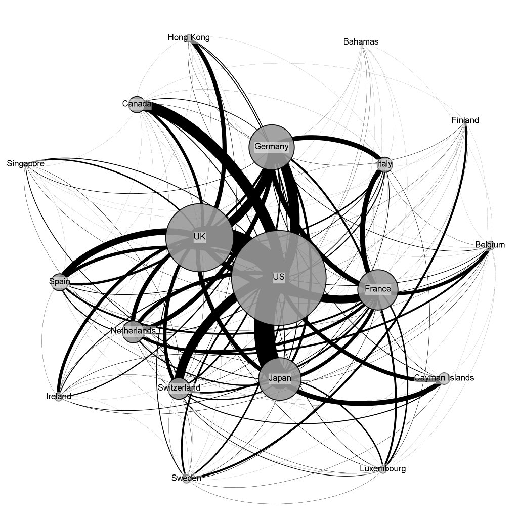
The following two visualizations take a slightly different approach. They also show the absolute size of assets booked in the respective jurisdiction, but, more importantly, they show the scale of the bilateral financial activity in two segments: 1) Portfolio investment (Coordinated Portfolio Investment Survey data by the IMF), 2) Banking activity (Consolidated Banking Statistics by the BIS).
 (click picture to enlarge)
This visualization shows the network of bilateral portfolio investment; the largest jurisdictions are located in the center, while the smaller ones are in the periphery. The visualization shows the 25 largest jurisdictions that together are responsible for over 90% of global portfolio investment. It intuitively becomes clear that the global structure of portfolio investment represents a hierarchical system with the US in the center with a small number of jurisdictions closely around it (primarily the UK, but also Japan, Germany, France and Luxembourg).
 (click picture to enlarge)
This visualization shows the global network of banking activity (the 19 largest jurisdictions that together are responsible for over 90%). This network is even more hierarchical than the previous one concerning portfolio investment. The US is clearly at the center of the system, while the UK represents a second major center that is, however, very closely connected to the US. Hence, this visualization is arguably a strong indication for a joint Anglo-American dominance in global finance.